.svg)
Responsive Web Design vs Adaptive Web Design: Which Is Better for Your Business?
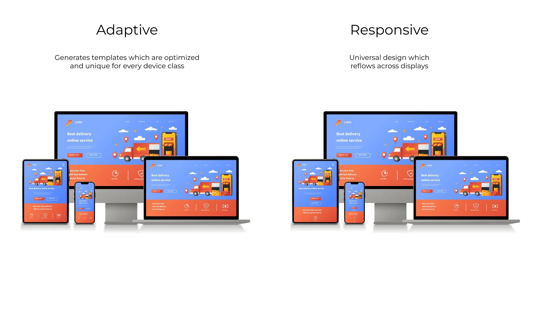
Choosing the right web design approach is essential for creating a website that delivers a consistent experience across desktops, tablets, and smartphones. Two commonly used approaches are Responsive Web Design and Adaptive Web Design.
Although both approaches aim to provide a better experience across different screen sizes, they work in very different ways. Understanding the difference between Responsive Web Design vs Adaptive Web Design can help businesses choose the right strategy for their website, application, and digital products.
What Is Responsive Web Design?
Responsive Web Design is an approach where a website automatically adjusts its layout and content according to the user's screen size and device.
Instead of creating separate layouts for different devices, responsive websites use flexible grids, images, CSS media queries, and fluid layouts to adapt continuously to different screen widths.
For example, a three-column desktop layout may automatically become a two-column tablet layout and then a single-column mobile layout.
Key Features of Responsive Web Design
- Flexible layouts and grids
- CSS media queries
- Fluid images and components
- One website layout that adapts to multiple screen sizes
- Better support for new and unknown screen sizes
- Consistent content across devices
What Is Adaptive Web Design?
Adaptive Web Design uses predefined layouts designed for specific screen sizes or device categories.
Instead of continuously adapting to every possible screen width, an adaptive website detects the user's device or screen characteristics and displays the most appropriate predefined layout.
For example, a website might have separate layouts optimized for desktop, tablet, and mobile devices.
Key Features of Adaptive Web Design
- Multiple predefined layouts
- Layouts designed for specific screen sizes
- Device or viewport detection
- Greater control over individual layouts
- Can provide highly optimized experiences for specific devices
- May require more design and maintenance work
Responsive Web Design vs Adaptive Web Design
The biggest difference between responsive and adaptive web design is how the website responds to different screen sizes.
| Feature | Responsive Web Design | Adaptive Web Design |
|---|---|---|
| Layout | Fluid and continuously adjusts | Uses predefined layouts |
| Screen Sizes | Works across a wide range of sizes | Optimized for selected screen sizes |
| Development | Usually simpler to maintain | Requires multiple layouts |
| Flexibility | Highly flexible | More controlled |
| Maintenance | Generally easier | Can require maintaining multiple layouts |
| Scalability | Excellent for new screen sizes | May require additional layouts |
| User Experience | Consistent across devices | Highly customized for supported devices |
How Does Responsive Web Design Work?
Responsive websites typically use a combination of flexible layouts, CSS media queries, scalable images, and responsive components.
When the viewport changes, the website automatically changes the arrangement, size, spacing, and visibility of elements to provide an appropriate user experience.
This makes responsive design particularly useful for modern websites because users may access a website using smartphones, tablets, laptops, desktop monitors, and even large displays.
How Does Adaptive Web Design Work?
Adaptive design generally starts with several predefined layouts. Each layout is designed around a particular screen size or device category.
When a visitor accesses the website, the system determines which layout should be displayed. The user then receives the layout that has been specifically optimized for that device or viewport.
This approach can provide more precise control over how a website looks and behaves on supported devices.
Responsive vs Adaptive: Which Offers Better User Experience?
Both approaches can provide an excellent user experience when implemented correctly.
Responsive design offers flexibility because the layout continuously adjusts to different screen sizes. This is particularly useful when users access a website from a wide variety of devices.
Adaptive design, on the other hand, gives designers more control over specific device experiences. Businesses with very different requirements between mobile and desktop users may benefit from this approach.
For most modern business websites, however, responsive design is often the more practical choice because it reduces the need to maintain multiple layouts.
Responsive Web Design and SEO
Website responsiveness is also important for Search Engine Optimization (SEO). Search engines need to provide users with pages that work well across devices, particularly on mobile devices.
A responsive website allows businesses to maintain a single URL and a consistent set of content while adapting the presentation to different screen sizes.
Responsive design can also contribute to better usability, mobile performance, and overall website experience, all of which are important considerations when developing an SEO-friendly website.
Performance Considerations
Website performance depends on much more than whether a website is responsive or adaptive. Image optimization, JavaScript, CSS, hosting, caching, server response time, and third-party scripts can all affect loading speed.
A well-built responsive website can perform extremely well when developers optimize assets and load only the resources required by the page.
Adaptive design can also provide optimized experiences for specific devices, but maintaining multiple layouts and implementations can increase development complexity.
Development Cost and Maintenance
Development cost is another important factor when comparing Responsive Web Design vs Adaptive Web Design.
Responsive websites generally require one flexible design system that adapts to different screen sizes. This can simplify development and ongoing maintenance.
Adaptive websites may require several versions of a layout. This can provide greater control but may also increase design, development, testing, and maintenance requirements.
When Should You Choose Responsive Web Design?
Responsive design is usually a strong choice when your business needs a flexible website that works across a broad range of devices.
Consider responsive web design when:
- You want one website that works across different devices.
- Your audience uses many different screen sizes.
- You want simpler website maintenance.
- You are building a new business or corporate website.
- You need an SEO-friendly website structure.
- You expect new device and screen sizes in the future.
- You want to reduce the complexity of maintaining multiple layouts.
When Should You Choose Adaptive Web Design?
Adaptive design can be useful when a business needs highly customized experiences for specific device categories.
Consider adaptive design when:
- You need highly specific layouts for different devices.
- Desktop and mobile users have significantly different requirements.
- You need precise control over individual device experiences.
- You are working with an existing platform that already uses adaptive layouts.
- Specific device-oriented functionality is an important part of the product.
Responsive Web Design vs Adaptive Web Design: Which Is Better?
There is no universal answer because the right approach depends on the project's goals, audience, functionality, budget, and technical requirements.
For most modern business websites, responsive web design is an effective choice because it provides flexibility, simplifies maintenance, and supports a wide range of devices with a unified design system.
Adaptive design can be the better solution for specialized projects where individual device experiences need to be carefully controlled.
Why Mobile-Friendly Web Design Matters for Businesses
Customers increasingly interact with businesses through smartphones and other mobile devices. A website that is difficult to navigate, slow to load, or poorly structured on smaller screens can create a poor first impression.
A mobile-friendly website helps businesses provide easier navigation, readable content, accessible interactions, and a consistent brand experience across devices.
Build a Modern Website with Code-OX Technologies
Choosing the right web design strategy is only the beginning. A successful website also requires thoughtful UX design, responsive development, performance optimization, security, SEO, and scalable architecture.
Code-OX Technologies helps businesses build modern digital solutions designed around their business goals. From responsive websites and custom web applications to e-commerce platforms and enterprise solutions, the right technology and design approach can help your business create a stronger digital presence.
Whether you need a new responsive website or want to improve an existing digital platform, selecting the right development strategy can make your website easier to use, maintain, and scale.
Final Thoughts
Responsive Web Design vs Adaptive Web Design is not simply a choice between two visual design techniques. It is a decision that can affect development, maintenance, user experience, scalability, and the long-term growth of your website.
Responsive design provides a flexible approach that adapts continuously to different screen sizes, while adaptive design uses predefined layouts to create more controlled device-specific experiences.
For most modern websites, responsive design offers an excellent balance between flexibility, usability, scalability, and maintenance. However, businesses with specialized requirements may find adaptive design more suitable.
The best approach is the one that aligns with your users, business objectives, and technical requirements.